Sunflower Wellness
Redesigning a local business's web experience


Sunflower Wellness is a new small business located in Milwaukee, WI. The owner, Amira, is a trained esthetician and ayurveda practitioner offering services to the Milwaukee community. She currently does her bookings primarily through Fresha, but wants to have a better web experience for her current and new clients.
Desktop First Responsive Redesign
Project Type
Research
UX Design
UI Design
Branding
Development
Scope
Figma
Google Suite
Google Meet
Goodnotes
WIX
Tools
3 months
Timeline
The Problem
Amira is an amazing practitioner, but she’s not a designer. Her current site isn’t meeting her or her clients needs.
The Objective
Create a web experience that invokes feelings of serenity, is simple to navigate, and promotes the booking of services.
She’s not providing bookings directly through her site, she’s unable to sell her products, and the branding and UI doesn’t represent her or her business.
The Process
Discovery
The discovery phase began with a client interview to highlight her vision for her website - she highlighted a desire to book through her site, being able to sell products on her site, and to update the branding to more accurately represent her and her clientele.
From here, I completed a heuristic analysis of the current website in order to assess overall usability. I followed up the heuristic analysis with user interviews and usability tests to understand users needs and frustrations with the current site.
Dissecting the Original Site
Let's review some heuristic concerns by comparing the original Ayurveda Services and Spa Services pages.
Click to enlarge


-
Upon hover of the service text, a link icon appears. This copies the text of the header rather than linking to book the services (like many users expected)
-
When looking at #2 on each screen, you'll see that the services are organized differently. Ayurveda services shows a long list while Spa Services utilize an accordion.
-
When comparing #3 between pages, you'll see the levels of information is very inconsistent with the service details.
-
The website logo and is so small that you're unable to distinguish what it truly is. Not shown is that some pages also have different logos featured.
-
Titles are not formatted in the same way.
Exploring how potential clients interact with the site...
I conducted 5 interviews and usability tests with potential clients that live in the Milwaukee, WI region. This uncovered their expectations, the current usability of the site, and how they were resonating with the visual design.
-
Booking services needs to be easy.
-
Need to have services descriptions and prices easily accessible.
-
Need to know who the practitioner is.
-
Need client testimonials to be available.
User Expectations
-
Service descriptions vary - some detailed and some lacking
-
Ayurveda service can be hard to understand.
-
Confused about what buttons are clickable and what aren't
-
Figuring out how to book was challenging.
Usability
-
Some enjoyed the photos while some found them unattainable.
-
They like the always visible navigation bar.
-
The color palette was dull and dark and they don't associate it with a spa.
-
The overall design seemed dated and boring.
Visual Design
Extracting Themes and Comparing Needs
With the research complete, I utilized affinity mapping to extract themes and insights from the user interviews and usability testing. Here are some of the key takeaways. These themes were then compared with the clients needs to create an action plan for developing the site.
Client Needs
-
Integrated booking feature
-
Visual redesign
-
Integrated product sales
User Needs
-
Booking services needs to be simple
-
The visuals need to be updated
-
Easily digestible service descriptions
How might we create a web experience that promotes the purchase of goods and services while creating a calming, inviting, and inclusive experience for clients?
Closing in on User-Centered Design
What Makes Sunflower Wellness Unique
Sunflower Wellness focuses on inclusivity for LGBTQ+ people and POC. The business holds a unique stance and focusing on providing services to those who don’t feel represented in other spa spaces. This drove the creation of User Personas so that her target clientele can feel represented in the design.

Before developing the user and task flows, the original site needed a sitemap update. The original navigation bar featured 6 options, while the new navigation bar features only 4 with a more layered approach.
Click to enlarge

Moving forward with a solution
One of the main issues identified during the research phase was that the booking process was to difficult so reworking the user flow here was very necessary.
In addition, the client has a need to sell products on the site, but is only able to offer pickup at her location. Due the the more complex shopping experience this would create, I also developed an integration between shopping and booking a pickup time.
Book a Service User Flow


Purchase Product User Flow
For the scope of this student project, I’ll focus on developing the Booking User Flow. Upon completion of the course, I’ll be returning to this project to finish the development of the site and provide full implementation for the client. At that point, I will be able to easily integrate the purchase product flow into the already developed booking flow.
Visualizing a User Focused Design
Through low-fi wireframing and rapid sketching I began to attach design concepts and patterns that could potentially work for this responsive design.


Let's open Figma and get this to mid-fidelity.


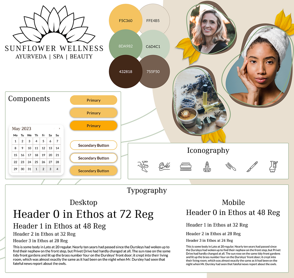
Before we step into High Fidelity Prototyping, we need to re-establish who Sunflower Wellness is. Through moodboarding and client collaboration a new logo was developed and a design theme was determined. Let’s explore the new Sunflower Wellness!
Getting inspired...

Creating a clearer logo
Before

After

While the original logo has a lot of character and brought vibrancy to the original design, when utilized on the site it became very difficult to read. We developed a simpler logo that represents her and the company more clearly. There are a small, medium, and large version of the logo to allow for readability across sizes.
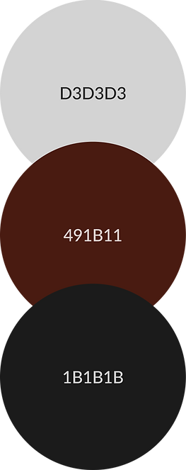
Building a new palette
Before
After
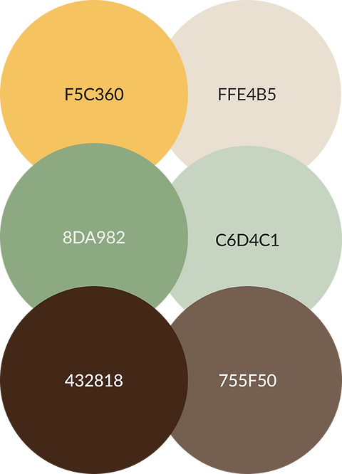
The original color palette was lacking a sense of vibrancy and serenity and isn't easily associated with a spa. Pulling inspiration from the name of the company, a new color palette was developed to drive home the brand and the types of services offered.
Why representation matters in design
One of the main challenges I faced was in sourcing images for the design. Most professional stock photos regarding spas features white women both receiving services and providing services. Amira is a POC working with POC clientele and LGBTQ+ clientele, and this needs to be represented in the site.
I worked with Amira to do a photoshoot of her providing services to a client that more accurately represents her brand. These photos are featured throughout the site.
We cannot overlook the importance of DEI in design.
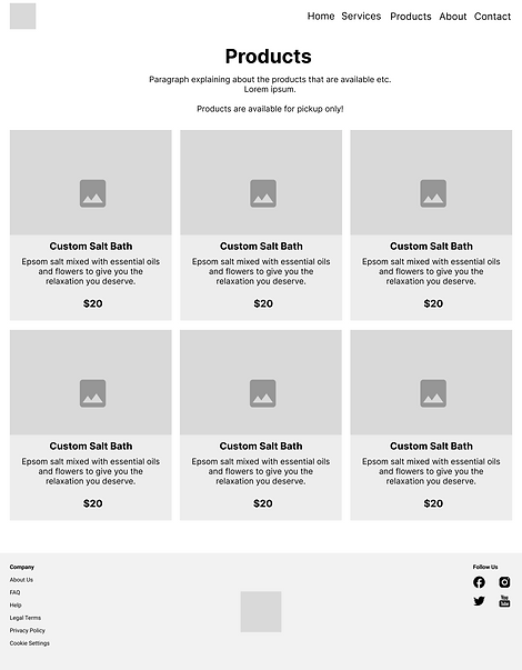
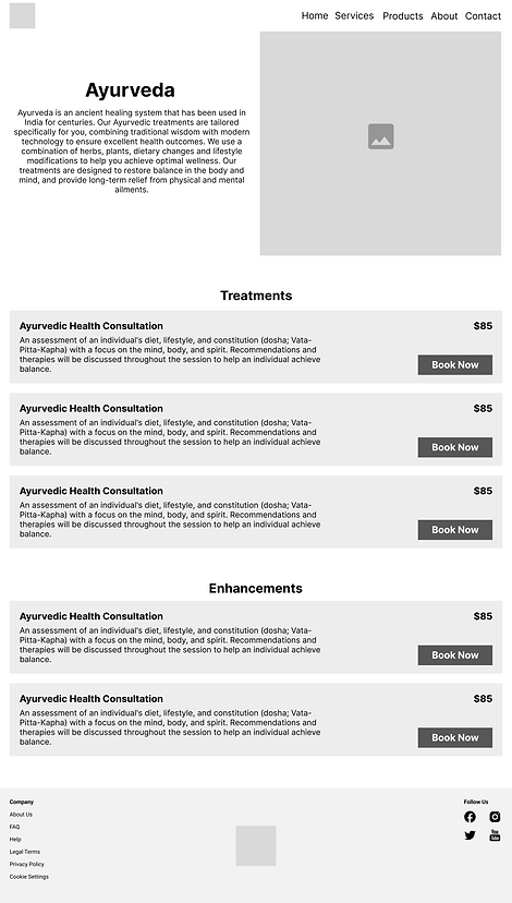
Creating the first draft of the design
Don't spend too much time here - save that for the final prototype!
Refining the Experience Through Testing
I performed usability tests with 5 users to determine the necessary revisions to make the experience more intuitive and pleasant.
Completed the user flow in under 5 minutes.
100%
Error rate while navigating the user flow.
10%
Reacted with positive emotion to the design.
80%
Priority Revisions from the Usability Tests
-
Application of color needs to be improved - the design feels a little too yellow and a bit too flat.
-
Create more depth with additional layers and visual interests.
-
Optimize content on the services page (where errors occurred)
-
Create more concise descriptions
-
A closer look at the edits
Updating the services card was vital as it was the only location that errors occurred during usability testing.


-
Added padding between text elements
-
Simplified the description to make it more clear
-
Enlarged the icons for each service
-
Add a hover effect to the icons to show their label
Relish the visual update featuring a neutral and calming color palette, enlarged photo, and background design that creates a sense of flow and flexibility.


The Final Prototype
Take a look at the desktop and mobile prototypes to get a feel for the responsive nature of the site.
Final Thoughts and Future Considerations
This project carries a lot of importance to me as it will inevitably affect the success of Sunflower Wellness moving forwards. Working closely with Amira and her clients has been an amazing experience, and creating an design that is inclusive and effective has been truly rewarding.
Upon graduation from my program, I worked with Amira to develop and publish her site. Amira was most comfortable utilizing Wix as her host, so we opted to design utilizing that. After a few weeks of using Wix, Amira was struggling with the booking feature. Due to that, we ended up bypassing Wix's booking feature and integrating Fresha to her site. This has allowed her to utilizing a booking software that she is familiar with while maintaining a fresh, inclusive, and effective website.
Since launching her site, Amira has increased her booking revenue by 200%. As Amira's business grows, there is potential for additional features like a blog, client portals, and virtual consultations. I'm looking forward to exploring these opportunities with her.